Most colour decisions get made from swatches, and most of them get made wrong.
A palette that looks decisive as three squares on a page can fall apart the moment it is distributed across panels — the accent disappears, the mid-tone turns muddy against black leather, the whole thing reads darker than intended because two-thirds of the surface is in shadow on a bike.
So this suit was designed twice. Not two sketches — two finished suits, both taken all the way to a spec the builder could have cut.
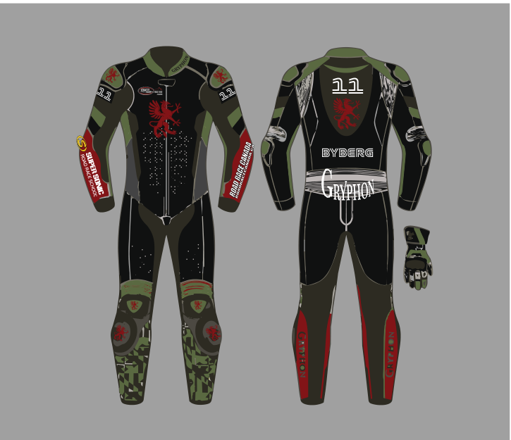
Direction one: olive
Army green across the shoulders, arms and knees, black through the body, a red griffin on the chest, red on the outer legs, and green digital camo on the shins.
The argument for it is simple and it is about the grid, not about taste. A MotoMini grid is red, white and blue, over and over. Olive is the one thing out there that nobody else is wearing. In a photograph of six bikes going into turn one, the rider in olive is the one you find first — not because the suit shouts, but because it is the only one not in the same three colours as everything else.
The red griffin on a dark olive chest is also just a good piece of contrast. Red on green is a hard pairing to get right and it works here because the green is desaturated almost to grey.
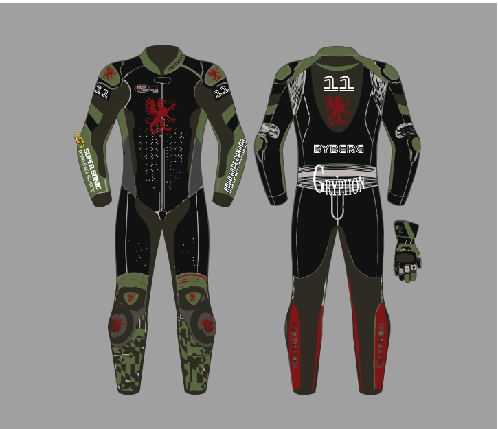
Direction two: charcoal, white and red
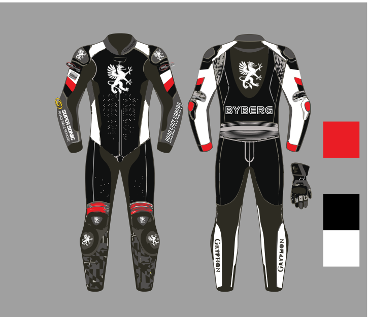
The other direction abandons colour almost entirely. Black body, charcoal panels, white shoulders and outer legs, red kept as a thin accent at the knees and collar. The griffin flips to white and gets larger.
This one is more conventional, and it is better in two specific ways. White shoulders and white leg panels catch light, so the rider separates from the bike in photographs instead of merging into it — a fully dark suit on a dark bike is a silhouette. And the white griffin at that size reads from further away than the red one did.
What it gives up is the thing that made the olive interesting. It looks like a fast rider's suit. It does not look like nobody else's suit.
Eight versions between the two, and almost every revision was moving one panel between black, charcoal and white and looking at it again.
The griffin is the whole identity
The move both directions share: Gryphon's own crest, used at full size as the suit's hero graphic — on the chest, and again across the upper back above the surname.
Normally the manufacturer gets a wordmark on the hump and that is that. Promoting their heraldic griffin to the main graphic does something a name cannot: it gives the suit a symbol. From behind, at speed, you do not read BYBERG — you see a griffin, and that is enough to know which rider it is.
It also solves a real problem with junior kit. A young rider usually has no personal logo, no team crest, nothing but a number and a surname. Borrowing the builder's mark gives the suit an emblem years before the rider has one of their own — and when we finally designed the family team logo, it took six versions and a name change.
Details that only matter once it is leather
The camo is recoloured, not reused. Green camo on the olive suit, grey camo on the charcoal one. Same pattern, different palette. Shins take the worst abuse on any suit — boots, sliders, gravel — and a broken pattern hides wear that a flat panel puts on display.
The palette is printed on the sheet. The grey version carries its actual colour chips beside the artwork: red, black, white. The builder gets colours, not adjectives. "Charcoal" means four different things to four different people; a chip means one.
The number appears three times — both shoulders and the centre back — and the surname once, across the shoulders. Super Sonic Road Race School and Road Race Canada run down the forearms, where side-on race photography actually catches them.
What I would tell anyone choosing between two designs
Do not choose from thumbnails. Build both properly, put them side by side at full size, and then ask the only two questions that matter: can I find this rider in a pack, and does it still work when it is scuffed, dusty and photographed in flat grey light at eight in the morning?
A lot of the suits on any grid were chosen from a swatch on a screen. It shows.
Got a suit or a set of team colours to decide on? I design race suits, event graphics and print for racing programs across Ontario.