MotoMini Canada runs the national mini road racing championship — the Road to MotoGP ladder in this country — and a race weekend at Shannonville Motorsport Park generates a lot of graphics. Every rider on the grid needs an announcement card. Every session produces results. It happens again at the next round, and the round after that.
That is not a design problem. That is a production problem wearing a design problem's clothes.
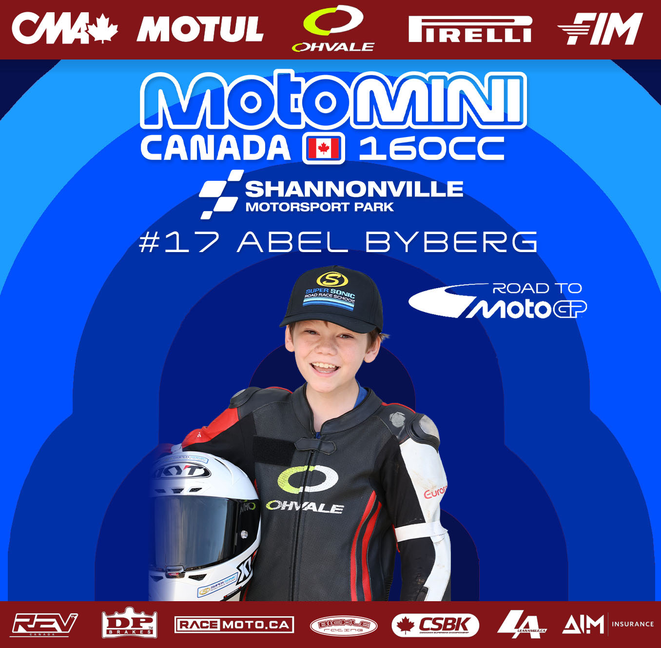
Two seconds, at thumbnail size
These get posted into a feed. Nobody opens them. They go past at speed, quarter-size, on a phone, between two other things.
So the layout answers one question before any other: who is this? The race number and the name are set as the largest type on the sheet after the series lockup, in a wide squared face that stays legible when the whole card is 300 pixels across. The rider is cut out of their background and set against flat colour, because a photo with a paddock behind it turns to mush at that size and a photo with nothing behind it does not.
Everything else on the card supports the number and the name, or it gets smaller.
Colour is doing a job, not decorating
The championship runs two classes, 160cc and 190cc. The 160 cards are blue. The 190 cards are red.
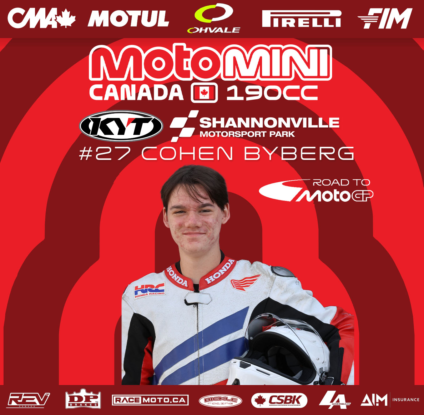
That is the whole system, and it means a follower knows which class they are looking at before reading a single word. Concentric arcs behind the rider carry the class colour through three or four tones, which gives the cut-out something to sit against and gives the card depth without adding anything anyone has to read.
Same skeleton, one variable. Consistency you can see at a glance is worth more than variety nobody notices.
The sponsor bars are the point
Two solid bands, top and bottom. CMA, Motul, Ohvale, Pirelli and FIM across the top. REV TV, DP Brakes, RaceMoto.ca, Bickle Racing, CSBK, LeanAngle and AIM Insurance across the bottom.
A lot of designers treat that as the constraint they have to work around. It is closer to the opposite. Those bars are why the series can put bikes on a track, and they appear on every card at a fixed height in a fixed order — which means the artwork area is a known rectangle every single time, and the marks never get resized, reordered or quietly dropped to make room for a taller photo.
Locking the thing everyone else fights with is what makes the rest of the card fast to produce.
A template earns its keep on a bad week
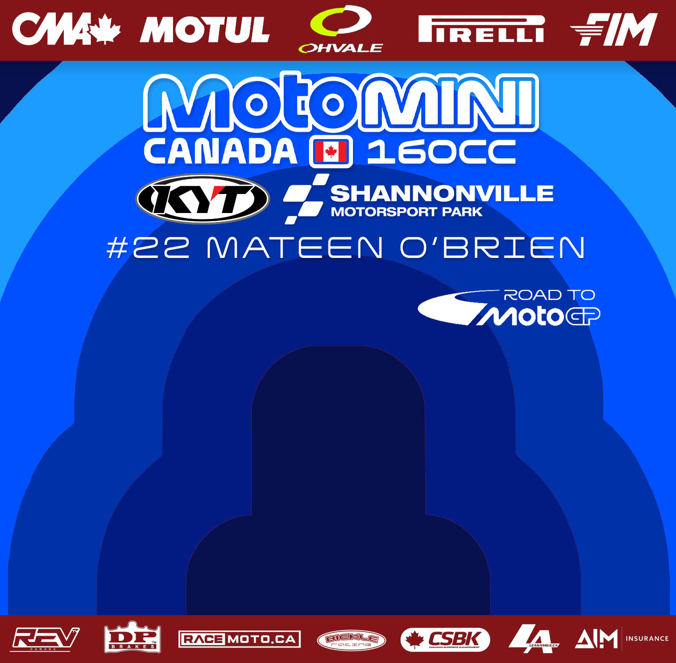
This is the version of the system I would actually point at.
A rider gets confirmed for the grid and there is no usable photo of them yet. The announcement still has to go out, because the entry list is news whether or not someone got to a camera. So the card ships with the silhouette in place — right name, right number, right class colour, right sponsors, correct in every respect except the portrait — and the photo drops in later without anything else moving.
A layout would have collapsed there. A system just carries on with one field empty.
Results are the same family doing a different job
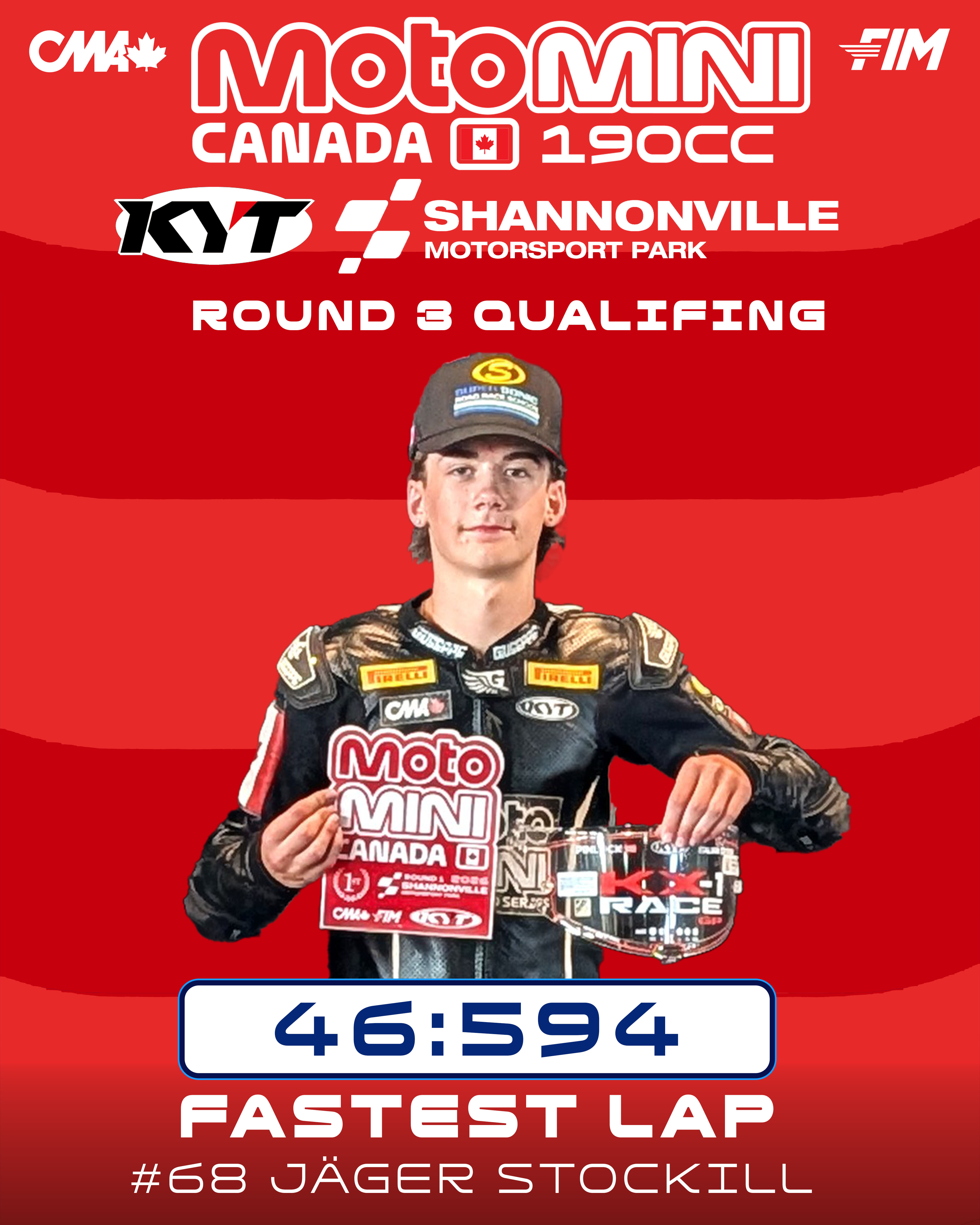
After a session like round three at Shannonville, the payload changes. It is no longer who is this — it is what happened. So the result card drops the sponsor bars, goes vertical for stories, and promotes one piece of information to the biggest element on the sheet: the lap time, boxed in white so it reads as a scoreboard rather than as a caption.
Class colour stays. The lockup stays. The typeface stays. Somebody who has seen four of these already knows what they are looking at before they have read it, and that recognition is the entire return on keeping a system tight across a season.
Race graphics are judged in worse conditions than almost any other design work: small, fast, on a phone, next to everything else in the sport. You do not design them for the person who stops and looks. You design them for the person who does not.
Got a season's worth of graphics that all have to look like they came from the same place? I design print, event and social media graphics for racing programs and small businesses across Ontario.