Print sits still. A shirt does not.
It walks around a paddock, gets photographed from behind while somebody is bent over a bike, gets worn by a coach and a fourteen-year-old and a parent working the gate — and the artwork has to survive all of it. Which makes apparel the design job least like the others in this portfolio, and the one where the most mistakes get baked in early.
Start from the actual garment, not a mockup
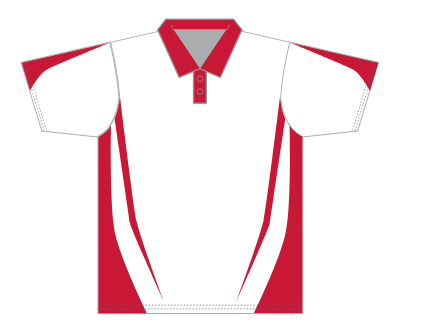
This is the blank. Not a stock shirt image with artwork floated over it — the manufacturer's own panel layout, with the real seam positions, the real collar and placket, and dotted stitch lines showing exactly where the fabric gets joined.
Everything gets designed inside that. The curved contrast panels running from the underarm down to the hem are not decoration I invented; they are where this garment's seams already are, coloured in.
Design on a generic mockup instead and you find out at sample stage that your chest logo is sitting on a seam, or that a third of your back graphic disappeared into a side panel. Sublimation is printed flat and then cut and sewn, so a placement error is not a reprint — it is a rebuild.
Sublimation makes colour free, and that changes the brief
Screen printing charges you per colour, per position. Sublimation prints the whole panel as one image, so a full-bleed photograph and a plain white shirt cost the same.
That single fact drives most of what follows. The background stops being background. It can be the design.
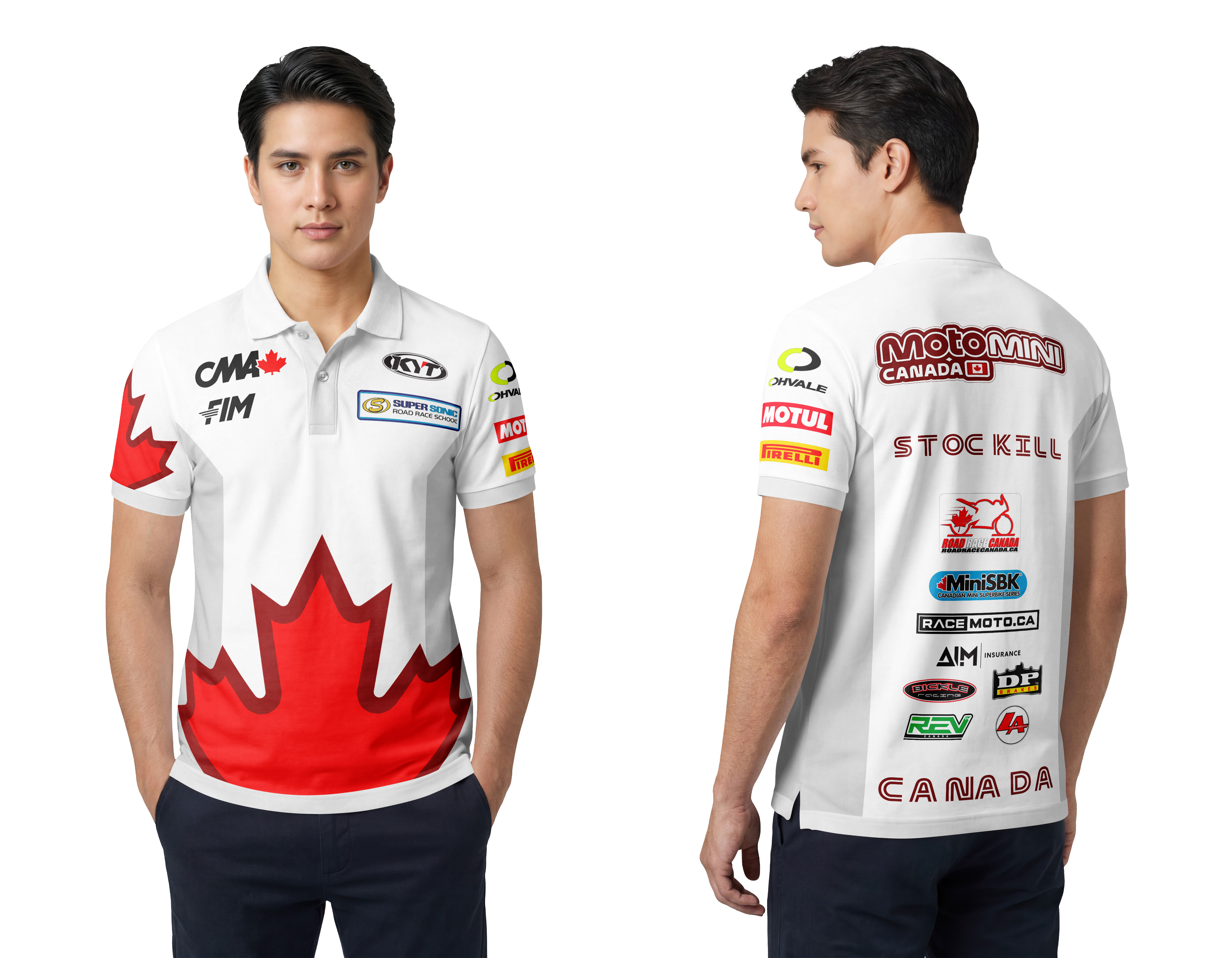
On the Team Canada rider polo, the maple leaf is not a chest print. It is the bottom half of the shirt, running off both side seams and off the hem, wrapping onto the sleeve. At conversational distance you read sponsors; from across the paddock you read Canada, because the garment itself is the flag.
You cannot do that with screen print at any sensible price. When the process gives you the whole panel for free, using it for a 4-inch logo on a blank field is leaving the budget on the table.
Three distances, three jobs
Every one of these shirts is designed to be read at three different ranges.
Thirty feet. One thing only: the leaf, or a big Super Sonic roundel, or MotoMini Canada across the shoulders. Whoever this person is, you know what organisation they belong to before you can see their face.
Three feet. The chest marks — KYT, Super Sonic, Road Race Canada — read while you are talking to someone. This is the row that does the work in the pits.
In a photograph. Sleeves. Motul, Pirelli, Ohvale, DP Brakes, RaceMoto, MiniSBK, AIM, Bickle, REV, LeanAngle. Small, stacked, and positioned where an arm reaching for a tyre warmer puts them in the frame.
That is the whole hierarchy, and it is decided by distance rather than by who paid the most.
The back is the largest uninterrupted surface you will ever get
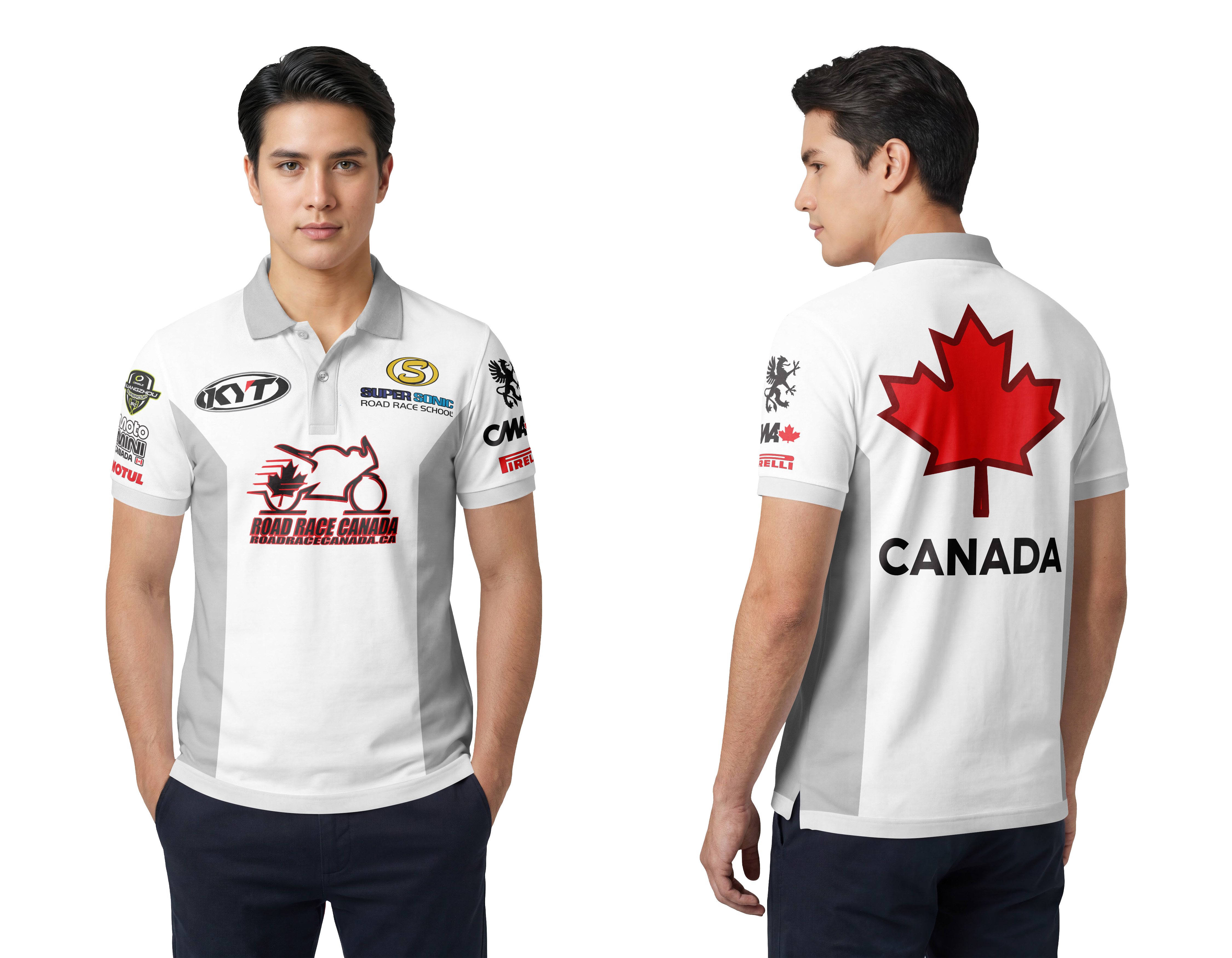
No collar, no placket, no buttons, no pockets. On a person standing in a queue or leaning over a bike, the back of a polo is a billboard that people look at for minutes at a time.
So it never gets a small logo centred in a sea of blank fabric. It gets one enormous mark — the leaf with CANADA under it, the Super Sonic roundel, the MotoMini lockup — or, on rider kit, the surname plus the full sponsor column stacked down the spine.
There is a floor on that, though. Below roughly half an inch, a logo with a tagline under it stops being a logo and becomes a grey smudge with a brand's name attached. If a sponsor cannot be given that much height, it is better on the sleeve at a size that works than on the back at a size that doesn't.
One blank, four identities
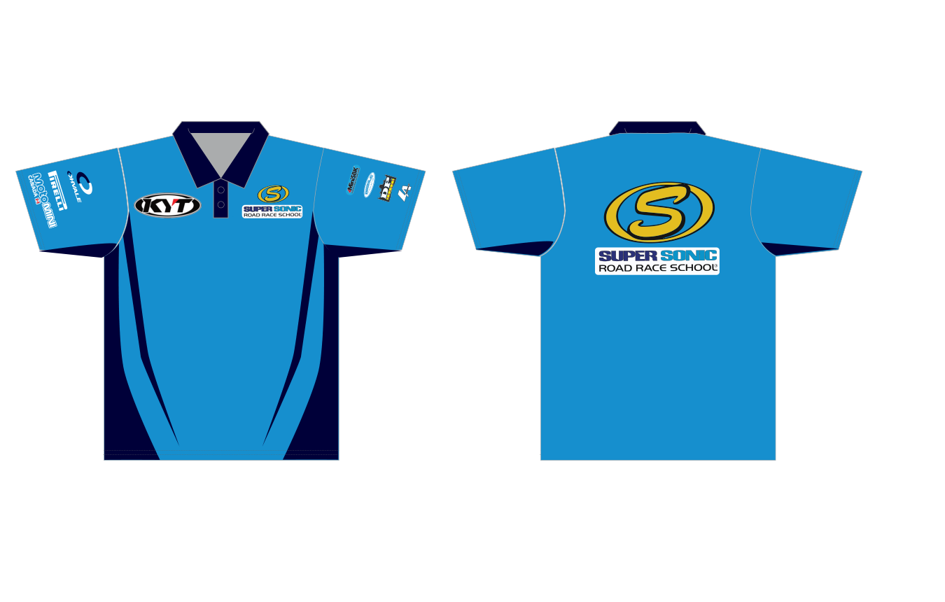
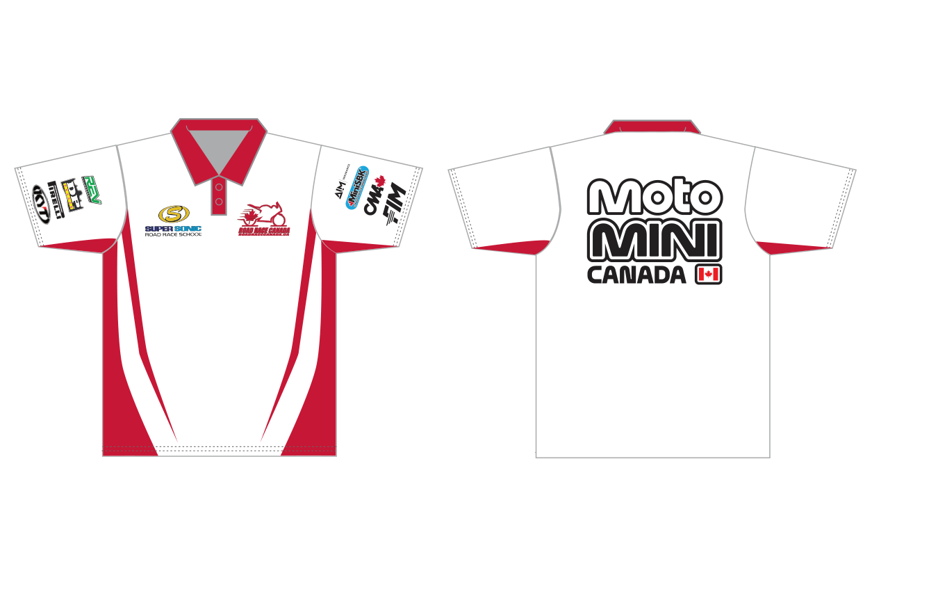
Same garment, same panel template, same seams. Cyan body with navy panels and the yellow roundel for the school; red and white with a black lockup for the national series; white and grey with red for Road Race Canada.
Nothing structural changes between them. The colour system carries the entire identity, which is exactly what you want when three related organisations share a paddock — obviously the same family of kit, never mistakable for each other at a glance.
Rider kit and organisation kit are not the same product
The series polo is generic on purpose. Anyone can wear it: staff, officials, a parent buying merch. No name, no rider-specific anything.
The rider polo carries a surname across the shoulders and the full sponsor column. It is a uniform, not merchandise, and it belongs to one person.
Designing them as one product is a common and expensive mistake — you end up with either merch nobody outside the team can wear, or team kit that looks like a souvenir.
Two things to get right before artwork starts
Get vector logos from every sponsor. AI, EPS or SVG. A logo pulled off a website is 400 pixels wide, and sublimation prints at full size on fabric — it will look exactly as rough as it is.
Leave room. Sponsors get added mid-season. A back panel filled edge to edge is a back panel that has to be redrawn in July.
Got team kit, a uniform programme or event apparel that needs designing? I design print, apparel and event graphics for racing programs and small businesses across Ontario.