A club suit gets looked at by the people in the paddock. A national team suit gets looked at by everyone else — on a grid in another country, in a series photographer's images, next to fifteen other countries' kits.
These are the suits the Canadian riders wore at the Supercup in China. Same design, seven riders, and the whole job was making one layout work for all of them without it turning into a suit each.
Read the country before you read the rider
At an international event nobody knows who these kids are yet. They know the flag.
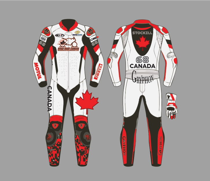
So the hierarchy is deliberate and slightly counterintuitive for a race suit: country first, rider second. A single large maple leaf on the upper back, CANADA set under the number, CANADA again running the full length of the outer leg and down the arm. The rider's surname is there across the shoulders, but it is smaller than the leaf and smaller than CANADA.
White base with red and black. There is no cleverness in that choice and there shouldn't be — a national kit that needs explaining has failed. From the outside of a corner at any distance, the read is: that one's Canada.
The same suit, seven names
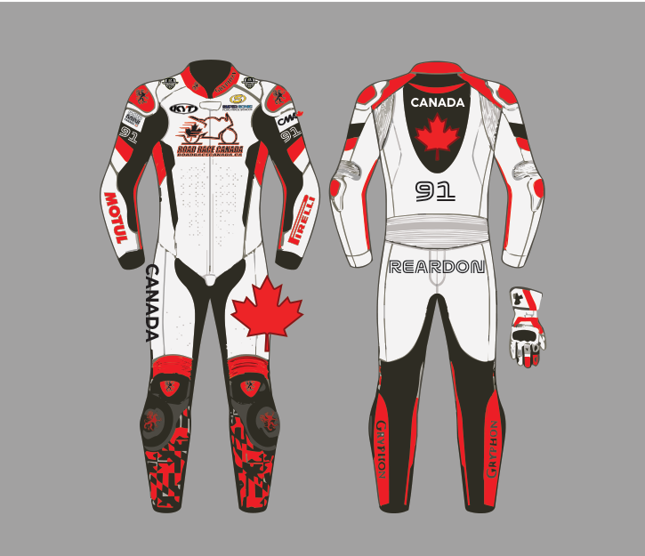
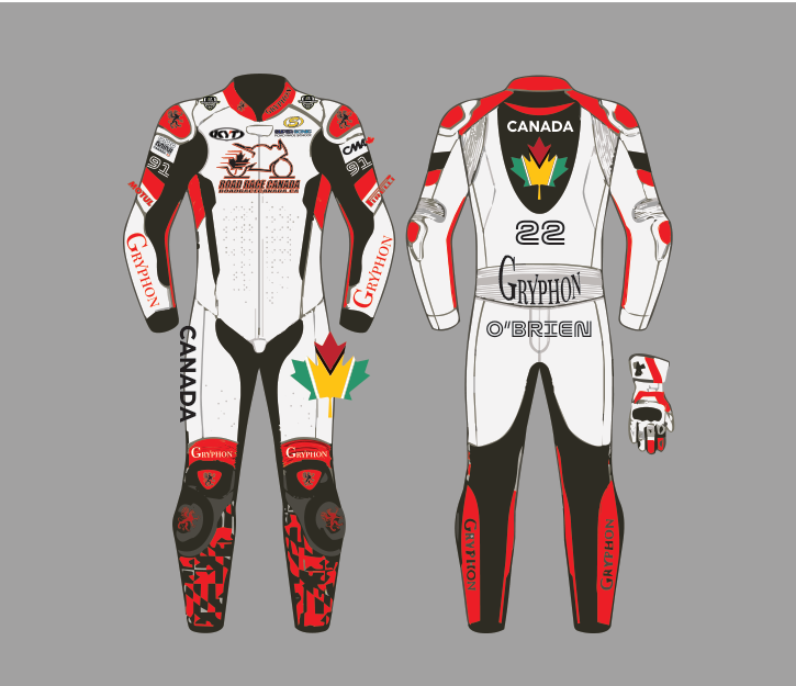
Three of the seven are shown here.
Everything structural is frozen. Panel shapes, sponsor positions, the leaf, the belt, the pixel-camo shins, the Road Race Canada mark on the chest, KYT at the collar, Motul and Pirelli down the forearms, Gryphon on the hump and both outer legs.
What changes is a name and a number, in three fixed places: both shoulders, the centre back, and the surname band.
That is what makes it a team. Seven riders walking down pit lane in kit that is obviously the same kit — that reads as a national programme. Put those same riders in seven "personalised" suits and it reads as seven kids who happen to be from the same country.
O'Brien's back panel runs CANADA above the number and the surname below the hump, rather than the surname on top — the one variant in the set, to fit a shorter number and a longer name without shrinking either.
Iteration is most of the work
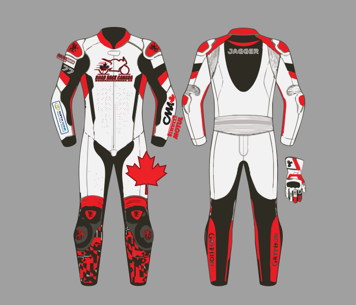
This one went through seven versions, and almost none of that was aesthetic.
Early rounds carried Gryphon down the forearms. In the final version the forearms belong to Motul and Pirelli, with Gryphon moved to the hump and the legs. That is the correct trade: the manufacturer's mark is guaranteed to be on the suit anyway, and the forearm is the single most photographed panel on a rider — side-on, from the outside of a corner, sleeve pointing at the camera through the whole apex. The series sponsors earned that space.
The rest of the versions were number sizes, name lengths, and where the leaf sits relative to the collar seam once there is a rider inside it rather than a flat drawing.
What it looks like in leather
The finished suits are the only real proof any of this worked.
Two things survive the translation from vector to hide better than you expect and worse than you hope. The MotoMini Canada lockup, printed across a white shoulder panel, holds its outline cleanly — because it was drawn with a heavy enough keyline to survive being laid on grain. The number, set as an outline in white on the black panel below it, stays crisp for the same reason.
What changes is colour. Ohvale's yellow-and-white roundel on a red panel and Motul's red on white are noticeably richer on leather than they were on screen, because dyed hide holds saturation differently to a monitor. This is exactly why the order form asks for Pantone rather than HEX, and why a design approved only on a screen is a design nobody has actually seen.
What a suit costs you if you get it wrong
Print you can reprint. A suit is cut, stitched and gone.
So the last version before it goes to the builder gets read like a proof, not looked at like a picture: every number in every one of its three positions, every name spelled out loud, every sponsor mark checked against the current sheet rather than against last season's.
That check exists because it is easy to build a rider's suit out of the previous rider's file and leave one of the three numbers behind. Worth a slow read of the final PDF every single time, on a piece where the revision round happens in leather.
Got a team kit or a suit that needs designing? I design race suits, event graphics and print for racing programs across Ontario.