Here is the constraint that shapes everything about a trophy: it has to be sitting on the table before anyone knows who won.
You cannot personalise it. You cannot wait for the result. Whatever is on it has to be true for whoever ends up holding it, and it has to be manufactured, shipped and unpacked before the first session goes out.
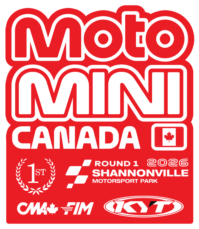
Die-cut to the logo, not to a rectangle
The trophy is not a plaque with a logo printed on it. The outline is the logo — the whole piece is cut to the silhouette of the MotoMini Canada lockup, so the stepped shoulders of the wordmark become the physical edge of the object.
That is the single decision the piece rests on. A rectangle with artwork inside it is a certificate. Cut the same artwork to its own outline and it becomes a thing — recognisable in a photo, at a distance, held up over someone's head, from any angle.
It also means the artwork and the manufacturing are the same file. There is no "background" to design, because there isn't one.
Three that are identical except where they aren't
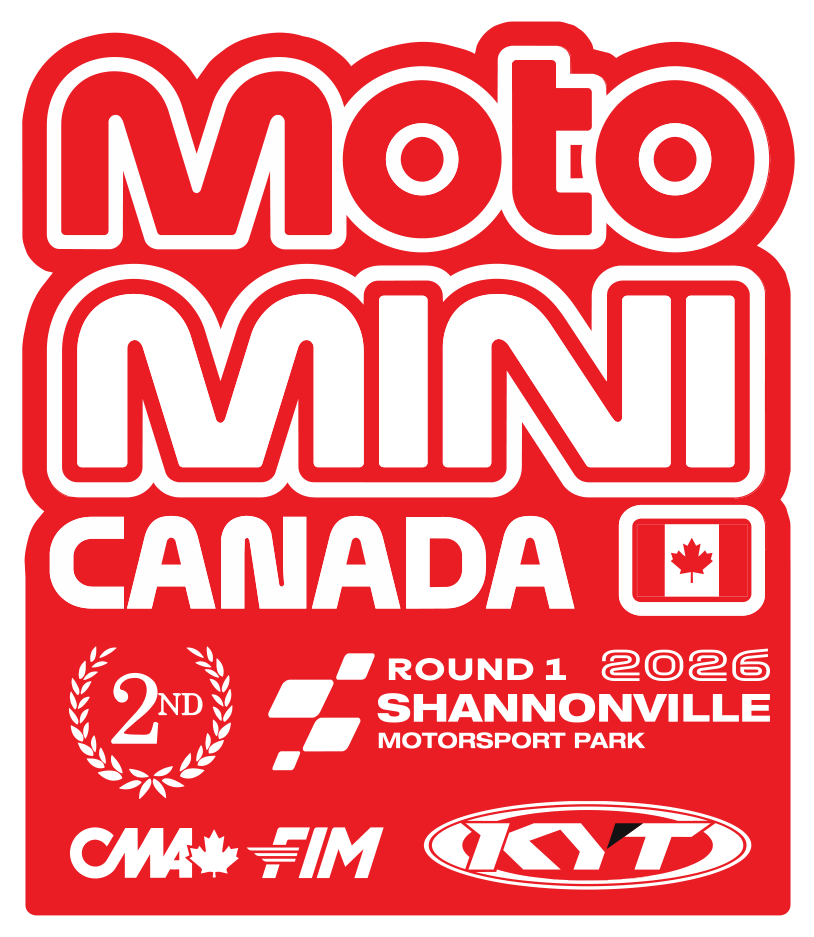
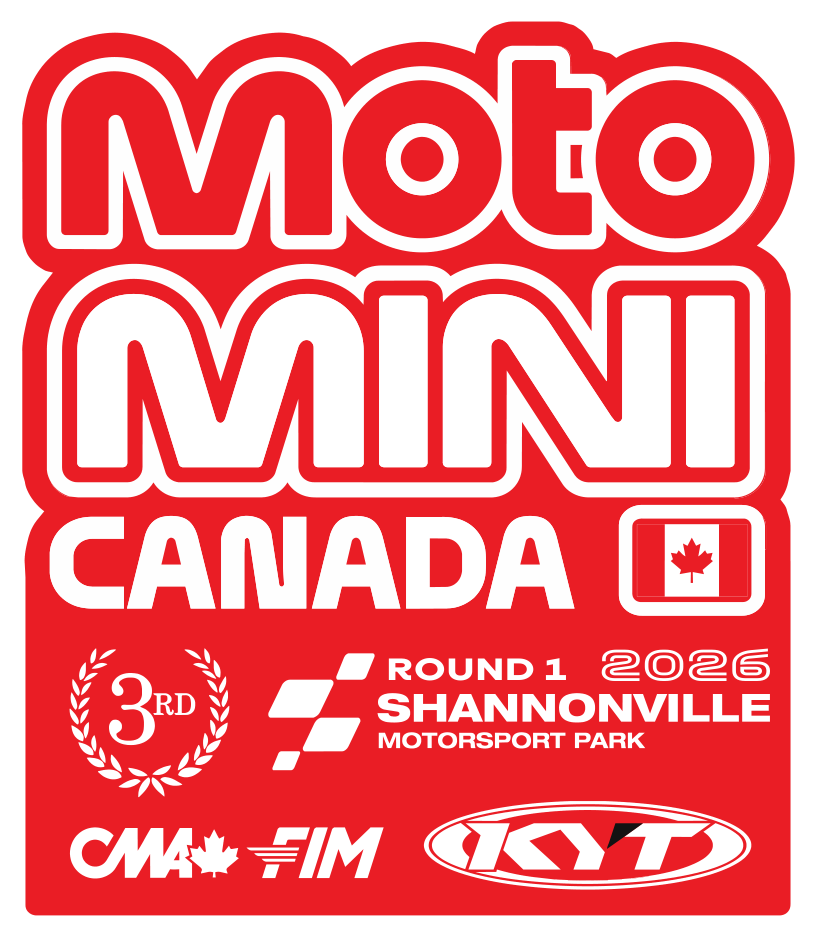
First, second and third are the same layout with one element changed: the numeral inside the laurel wreath.
Not a colour change. Not a size change. No silver-and-bronze treatment, which is the reflex and which is wrong here — it makes second and third look like cheaper versions of first, and a kid who finished third at a national round did not get a cheaper day than the winner.
All three are the same red, the same size, the same weight. What separates them is one character. That is enough, because everyone at a podium already knows the order.
Below the wreath, the information the trophy has to carry forever: Round 1, 2026, Shannonville Motorsport Park, with the flag-block mark. Then CMA, FIM and KYT along the bottom edge. Sanctioning bodies get the same treatment as sponsors — a fixed strip, always in the same place, never resized to make room.
The named version is a different object
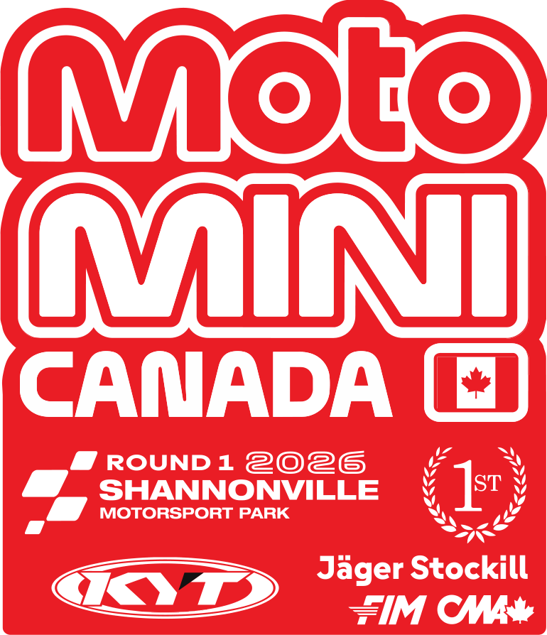
There is a second layout where the rider's name is set into the piece and the lower block rearranges around it — the laurel and numeral move right, KYT moves left, and the name sits where it can be read cleanly at engraving size.
This one cannot be made in advance, so it is not the podium trophy. It is the version that exists once the result is known.
Two layouts, one identity. The generic one is what gets handed over on the day; the named one is what a rider keeps. Designing both at the same time is how you avoid the usual outcome, which is somebody squeezing a name into a layout that had no room reserved for it.
Built to be scaled up
The set exists at trophy size — roughly 7.4 by 8.5 inches — and also as a cut file at 45 by 53 inches, the same artwork with the same proportions at roughly six times the size.
That is not a bigger trophy. That is the same mark ready to become a podium backdrop, a paddock sign, or a display piece, without anyone redrawing it or scaling a raster file up until the edges go soft. Vector artwork built once, at the correct proportions, output at whatever size the weekend needs.
That is most of what separates a design that survives a season from one that gets rebuilt every time somebody asks for it slightly larger.
If you have seen the MotoMini result cards, the red plaque that #68 is holding up in the fastest-lap graphic is this piece. Which is the real test of a trophy: it has to look right in the photo taken thirty seconds after it is handed over.
Got an award, a plaque or a series identity that has to be made, not just printed? I design print, event and social media graphics for racing programs and small businesses across Ontario.